The Quality Dashboard displays detailed information on the amount of rework required during QC within various interactive charts and tables.
When accessed from the User Home Page, the dashboard displays information for a single study; when accessed from the Metrics area of eTMF, the dashboard displays information for all studies. You can filter the dashboard to display only the information you need by using the facets that appear in the Filters Panel on the left.
You can collapse the Filters Panel (and expand the display of charts and tables) by selecting the left-facing arrow at the top of the panel. In addition, you can collapse any of the dashboard areas by selecting the down arrow next to the area’s title.
Use the icon at the top right of the page to export the dashboard information to an Excel file. You can access the Excel File from the Downloads area of eTMF. Note that if there are more than 32,000 results to export, only summary information from the charts will be included in the export file; report details will not be included.
Analysis
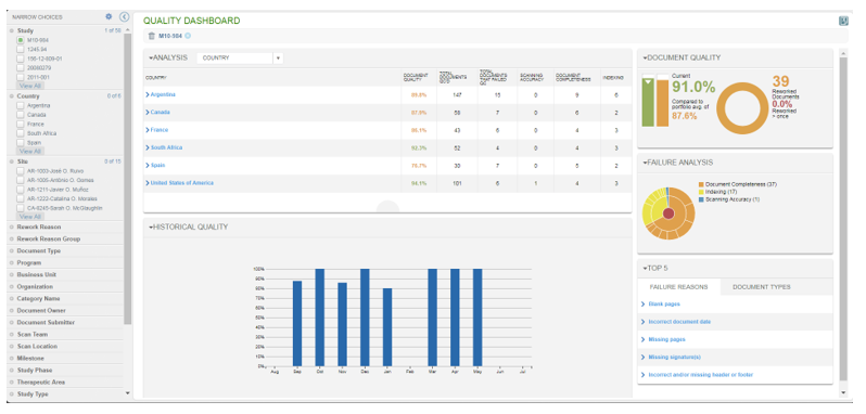
The Analysis area allows you to view the total number of documents QC’s, total number that failed QC, and a breakdown of those that failed. The data can be grouped using the selections in the Analysis dropdown (for example, by rework reason). If you select a grouping from the table, the dashboard filters to show only relevant data for that grouping.
Failure Analysis
The Failure Analysis area shows the main categories and subcategories of failure reasons. Hover over a pie segment to see what it represents, and select a pie segment to view the reasons for each failure type (e.g., Document Completeness, Indexing, Scanning Accuracy).
Top 5
In the Top 5 area, you can view the five most used failure reasons for the selected data set or the five most failed Document Types. For example, you might want to apply a Document Type filter and then view the reasons most commonly used when failing that Document Type.
Selecting a reason or Document Type adds the value to the set of filters applied.
Document Quality
The Document Quality area displays the current quality compared to the portfolio average (i.e., combined quality metric for all studies you have access to). You can see how many documents have been reworked and can also view the percentage of those documents that needed to be reworked more than once.
Historical Quality
The Historical Quality area displays a bar chart that allows you to view the percentage of documents that passed QC the first time for each month within the past year. Hover over each month to view the percentage.
